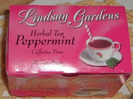
Hot magenta, like its duller cousin pink, is in the red family. It is bright and attention grabbing, reminding me both of the eighties and of neon signs in Vegas. That connection has more significance than merely attracting the eye, however. Research has shown that people gamble more and make riskier bets when seated under a red light as opposed to a calming blue one. Crayola introduced this vibrant color in 1972 in its "Fluorescent 8" box. Very few things in nature have quite this hue, save a fiery show at sunset. Very few things in our house have this hue, except a stripe on a beach slipper and a few odds and ends we found about the house. While assembling things for afternoon tea, however, I noticed just how close to hot magenta the box of peppermint tea is.

I also couldn't help but notice that our afternoon tea was a study in the colors we have looked at thus far:
Chestnut (which I skipped) in the interior of a teapot which has never been washed. I purchased this in Germany as I was preparing to return home after a year as an exchange student on the little peninsula of East Frisia. While being instructed in its care, I was informed that I was never to wash the inside. The gradual blackening is part of the natural ritual of tea in East Frisia and is thought to add flavor to the tea. To me, this is a most homey, inviting color.

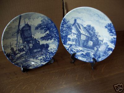
Sky blue is the design on the cups also purchased in East Frisia. They are not the tradional "East Frisian Rose" pattern famous at least in the area. But it is a popular motif, and this color is closely associated with Frisia, both on the Dutch and German side of the border. The cups and saucers are handpainted and each bears a slightly different design.
Lemon yellow is the pale first cup of peppermint tea. Not as dark and richly inviting as the traditional East Frisian Broken, this tea comes close to a lemon yellow before it has steeped sufficiently.

And white, of course, is the white porcelain interior of the cup. And the sugar in the little sugar pot. And, when we have a more traditional tea, the cream in the little cream dish which is gently floated on the surface of the tea, left to swirl in the heat but not stirred in.
I also couldn't help but notice that our afternoon tea was a study in the colors we have looked at thus far:
Chestnut (which I skipped) in the interior of a teapot which has never been washed. I purchased this in Germany as I was preparing to return home after a year as an exchange student on the little peninsula of East Frisia. While being instructed in its care, I was informed that I was never to wash the inside. The gradual blackening is part of the natural ritual of tea in East Frisia and is thought to add flavor to the tea. To me, this is a most homey, inviting color.

Sky blue is the design on the cups also purchased in East Frisia. They are not the tradional "East Frisian Rose" pattern famous at least in the area. But it is a popular motif, and this color is closely associated with Frisia, both on the Dutch and German side of the border. The cups and saucers are handpainted and each bears a slightly different design.
Lemon yellow is the pale first cup of peppermint tea. Not as dark and richly inviting as the traditional East Frisian Broken, this tea comes close to a lemon yellow before it has steeped sufficiently.

And white, of course, is the white porcelain interior of the cup. And the sugar in the little sugar pot. And, when we have a more traditional tea, the cream in the little cream dish which is gently floated on the surface of the tea, left to swirl in the heat but not stirred in.
What colors come together in your daily routines? How do they make you feel? Most of the colors in our tea time are cool, tranquil colors. There is the warm glow of the candle under the tea pot, the soft pale color of the tea and the doily, the tarnished silver which still reflects the light of the candle and the soft blue shades of the tea cups themselves. It is very warm and inviting, relaxing and comforting. Part of this is attributable to the psychology of the colors, but I'm sure most of it has to do with the repetition of a ritual which I have partaken of, off and on, since I was 17, but which itself stretches back over a century in the region I lived. And, in turn, the experiences I'm sure have an effect on how I and my family interpret these colors.

For a project with this color, try observing the sunset and picking out the various hues of yellow and red which streak across the skies. These colors, like the blue sky, are due to Rayleigh scattering. Try copying this in chalk for a more blending effect, or in marker to highlight the brightness of the sunset.
For more on A Year of Color, here is my directory of colors I've done so far. Here is Happy Things' blog. And here is the flickr group where you can look at a variety of hot magenta items. Enjoy!
Related Tags: color, art, a year of color, hot magenta, teaching art, homeschooling, home school
